There is a multitude of metrics and reports that are associated with Agile and Scrum.
But often they are used in the wrong way. And sometimes, not used at all.
Let’s review what useful metrics and relevant graphs you can implement in your team to track progress and improve.
In this video, I’d like to talk about some Agile metrics. More specifically, about some graphs and visualization reports that can be extremely useful in certain situations.
I’ll also do a quick overview of what Jira has to offer since it’s a very popular tool used by so many teams.
An important disclaimer: everything I will be talking about in this video is not mandatory for Scrum Teams.
These are just complimentary practices you may decide to use.
Don’t implement them in your team if there is no need for them.
I’ve already talked about velocity in my previous videos, such as this one.
So if you are completely new to the topic of velocity and have no idea how it is usually calculated and used I recommend you check out this video first and then come back here.
I will be using metrics such as velocity to help me create the reports here.
Watch the video or keep reading…
Ok, Scrum Team reports.
There are three key reports I’d like to talk about here: velocity chart, burndown and burnup charts, cycle time and control chart.
Velocity chart
Let’s look into how this is presented in Jira.
Here you can see two numbers tracked: committed story point and completed ones sprint after sprint.
Committed points show how much work the team thought they would complete in a sprint.
Completed shows the actual work completed.
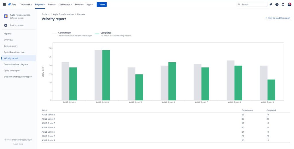
How should you read this graph?
Firstly, you should expect variations in the numbers – those are absolutely normal and should not be immediately considered a cause for alarm.
Committed versus completed points will rarely be the same.
But it can give you some insights into how well the team is planning.
- Do they have a tendency to overcommit, as in, take in much more work at the beginning of the Sprint but only completing a small amount?
- Or the other way around, do they have a tendency to under commit and have to add new work during the sprint all the time?
These questions can give you some good improvement opportunities that you can discuss in a retro.
If the completed points jump up and down a lot, it can give you some discussion points as well.
For example, in sprint 5 there was a huge dip in the number of points completed. Some questions to ask:
- What happened to cause this decrease?
- Was it a one off issue or something we need to be wary off in the future?
- How can we avoid it?
It may be something not to worry about like end of year holidays when most of the team was on vacation.
Or maybe on the contrary that highlights a big impediment that the team needs help resolving.
Measuring Scrum Team Performance Guide
This is a guide focused on helping you and your Scrum Team to collect appropriate Agile metrics for continuous improvement and working with management.

Burndown chart
Burndown charts can be quite useful for forecasting.
Usually it is used within a sprint by the team to show progress towards the end of the sprint.
It can show how likely the team will be able to complete the work.
It can highlight issues early on to allow the team to adapt their Sprint Backlog accordingly.
Here on this graph you can see progress day by day. This is an example of a Jira graph from O’Reilly.
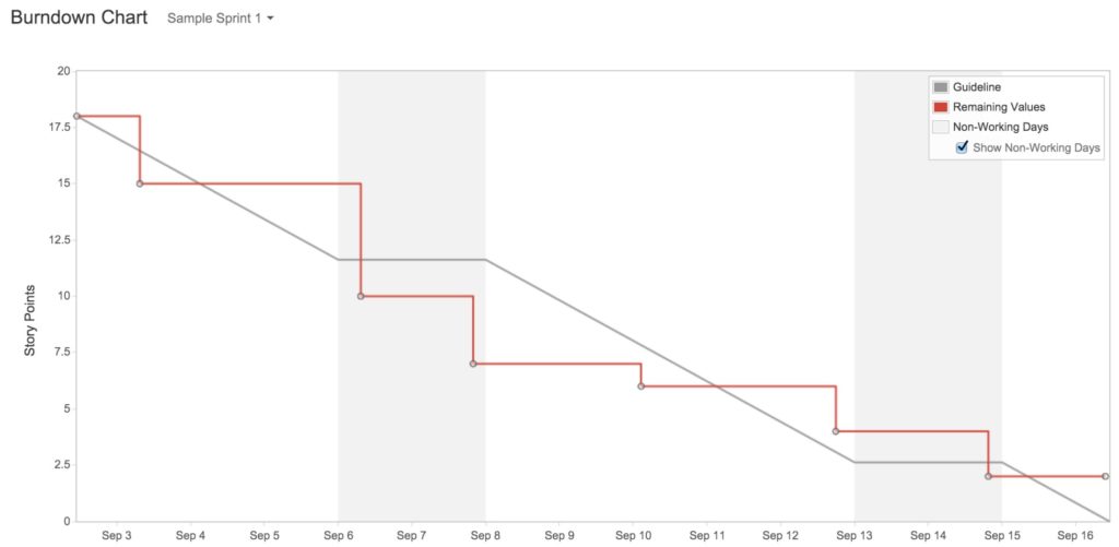
The team has started on the first day with 17.5 points of work and completed 2.5 points on the first day.
On the next two days they didn’t complete anything as the line is flat.
Then on September 6th they completed 5 points.
We can see how close they are to the ideal line – the gray one.
Fluctuations are normal, of course.
It might happen that on the first couple of days the orange line goes up as the team adds more work into their Sprint Backlog instead of burning through it.
That’s also normal behavior since as the team starts working on something, they will discover new information that may impact the amount of work in the Sprint.
Unfortunately, Jira does not track sub-tasks and only track tickets on the level of user stories, bugs, and tasks.
So your team will need to spend some extra time on splitting work into smaller pieces.
It is a great practice, but it takes time to develop.
Otherwise, if you have huge Product Backlog items that take half a Sprint to complete, you’ll have a flat line all the way through the first half of the Sprint.
This is not very helpful.
In addition, the team needs to be very diligent in updating the status of their work or the graph will be useless as well.
One important point I want to make here: Sprint Burndown chart is NOT something that a Scrum Master tracks and updates.
It is a tool Developers may decide to use to help them track their progress.
However, you can also use the burndown chart on the level of a release or an epic.
It’s basically the same as with tasks in Sprint Burndown, but you look at longer period of time and bigger scope.
You can use this burndown charts in your Sprint Review or any time when talking with stakeholders.
It can easily show progress towards goals and give a general idea if the team is on track or some changes to scope or dates are needed.
There are graphs provided by Jira that I absolutely love, but I haven’t seen them used anywhere else. So I’m not sure if other tools provide something like that. But I want to share them here.
They may seem a bit confusing at first, but once you get them – they can provide a lot of valuable information.
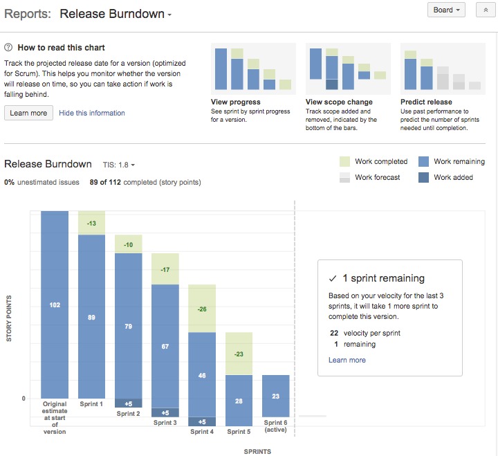
It’s burning down same as on the graph with the line, however, it also makes it more visual and clear.
The biggest difference is if work is being added it doesn’t make the line go up, instead it adds it to the bottom.
This means that we have more to burn down through before we get to the bottom. Like here in Sprint 2 5 story points were added, same happened in Sprints 3 and 4.
The green part shows how many story points were completed in the Sprint, and the rest is everything else we yet need to do.
Why I love this graph is because it can give you forecasts. For example, here it says that based on teams velocity for the last 3 Sprints, they’ll need one more Sprint to complete everything.
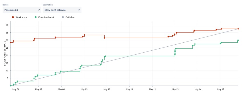
Burnup Chart
Burnup chart is kind of the opposite of the burndown, just instead of going down, we are going up. Obviously.
It can easily show the work added by moving the top orange line up, or if it is removed, the line will go down.
Our goal is to get the orange and the green lines meet. Usually by a certain date that you can set up in Jira.
But as we know – when we work in a complex environments, our forecasts will need to be updated regularly as we learn more.
Jira for Scrum Masters and Agile Teams
In this online course, we cover the essential functionality you need to know as a non-admin Jira user.

Cycle Time and Control Chart
Cycle time is another useful metric. It basically means – how much time it takes on average between starting the work and completing the work item.
How long does it take for a Product Backlog item to get from first being marked In Progress to Done?
This can be very useful in identifying whether your team needs to spend more time on refinement and highlight other improvement opportunities.
Actually… I’d say even without calculating cycle time, your team most likely needs to spend more time on refinement anyway. 99.9% of teams do.
Ask yourself this question: How does cycle time compare to our Sprint length?
For example, if your Sprint is 2 weeks long, and your average cycle time is 20 days that can be a big red flag. It means that the team on average is not able to complete a work item within one Sprint.
Or if your cycle time is 7 days for a 2 weeks Sprint, it might be cutting it a bit too close for comfort. The risk of not being able to complete a work item are much higher if they take almost the whole Sprint.
Here your team needs to spend more time on splitting the work in smaller batches.
On the contrary, if your project management software is showing your cycle time as something completely ridiculous like 1 hour, it most likely means that the team creates the work items once they are already done.
That’s a bit concerning because this work is not being tracked properly and you should address it.
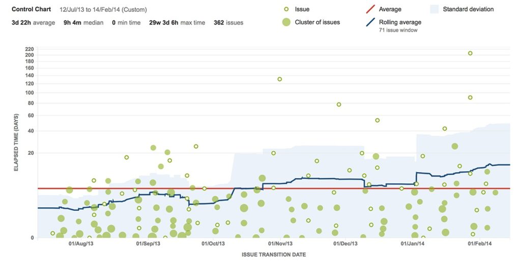
Jira provides a handy Control Chart that uses Cycle Time to create some forecasts.
It looks a bit scary when you first open it, but just focus on the information you actually need, and ignore everything else.
The red line shows you the average cycle time. On this graph it seems to be about 11 days.
The blue line shows the average based on a smaller amount of work items so I’d say it is closer to reality.
How is the blue line trending? Are we getting better and reducing cycle time or not?
But then what you should look at are the green dots and highlight any strugglers that are sitting far away from the average. Here is where you can do some analysis:
- What happened with these work items that it took 200 days to complete them when the average cycle time is 11 days?
- What can be done to avoid creating work items like this in the future?
And I think that will be it for this video.
There are many more agile metrics that you can use with yout team.
I have a whole section of videos on this topic in my blog that I’ll link in description. I also have an essential guide called Measuring Scrum Team Performance. There I share over 40 specific examples of metrics you can collect in relation to your product, team dynamics, and processes. It also comes with several metrics visualisation templates in a PowerPoint format.
Anyway, to summarize what we talked about today.
- You can use velocity chart to help your team in planning.
- You can use the burndown or burnup charts to see real-time progress towards goals.
- And you can use the cycle time and control chart to highlight issues related to team processes.

